
The role of typography in brand identity

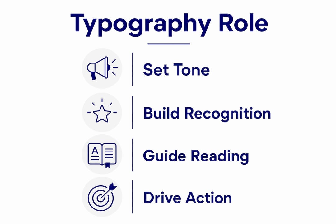
Typography is defined as the visual tone of voice your brand speaks before a single word is read. Every typeface choice signals something to your audience: authority, warmth, precision, or playfulness. The role of typography in brand identity extends far beyond aesthetics. It shapes consumer trust, guides reading behaviour, and appears across every brand touchpoint, from your website and packaging to your invoices and internal documents. Brand managers who treat font selection as a design afterthought are leaving one of their most powerful communication tools underused.
How does typography express brand personality?
Typography influences a brand’s perceived personality and positioning before words are read. That is not a minor detail. It means your audience is already forming an opinion about your brand the moment they see your letterforms, not when they process your copy.
Different typographic styles carry distinct emotional signals:
- Serif typefaces (such as those with small strokes at the ends of letters) evoke tradition, authority, and luxury. Think of the weight and gravitas a serif brings to a financial services brand.
- Sans-serif typefaces communicate clarity, modernity, and approachability. They are the default choice for technology and consumer brands that want to feel accessible.
- Geometric typefaces use precise circular and angular forms to signal innovation and confidence. They feel engineered rather than organic.
- Rounded letterforms convey warmth and friendliness. A children’s brand or a wellness company benefits from the softness rounded type creates.
- Script and display typefaces suggest creativity, individuality, and craft. They work well for premium artisan brands but carry real legibility risks at small sizes.
The critical insight here is that typeface selection is a branding decision, not a design one. Your creative team should choose typefaces that reflect your brand’s values, not simply what looks attractive on a mood board. A luxury skincare brand that uses a rounded, playful sans-serif is sending a contradictory signal to its audience, regardless of how beautiful the photography is.
Pro Tip: Before finalising a typeface, write out your brand’s three core values and ask whether the letterforms visually reinforce each one. If they do not, keep looking.

Does consistent typography build brand recognition?
Consistent typography creates brand familiarity, and familiarity builds trust. Repeated use of the same typefaces across digital and physical materials produces a cohesive brand experience. Consumers begin to recognise your brand before they consciously register your logo or colour palette.
The opposite is equally true. Loosely defined typography systems cause brand drift. When different teams, agencies, or platforms apply different fonts, weights, or spacing rules, the cumulative effect is a brand that feels fragmented and unreliable. Consumers notice inconsistency even when they cannot name it.
A well-structured typographic system covers five core elements:
- Primary typeface. The dominant font used for headlines and key brand moments. This carries the most personality.
- Secondary typeface. A complementary font for body copy and supporting text. It should contrast enough to create hierarchy without clashing.
- Weight and scale rules. Defined guidelines for when to use bold, regular, or light weights, and at what sizes.
- Spacing standards. Letter spacing (tracking), line height (leading), and paragraph spacing all affect readability and brand feel.
- Documented usage guidelines. Written rules that any team member or agency partner can follow without interpretation.
Defining clear rules for typographic hierarchy, weight, scale, and fallback options prevents brand drift and keeps your voice consistent across teams. This is the difference between a brand that feels considered and one that feels assembled.
Pro Tip: Store your typographic guidelines in the same document as your colour and logo rules. Typography is not a footnote to your brand guidelines. It belongs at the centre.
How does typography direct consumer behaviour?
Typography directs consumer reading behaviour, signalling whether to skim, compare, buy, or wait. That makes it a strategic business decision, not just a visual one. The way you structure type on a page or screen determines what your audience pays attention to, in what order, and for how long.
The table below shows how different typographic roles serve different communication goals:
| Typographic role | Primary function | Brand communication goal |
|---|---|---|
| Headline type | Captures attention immediately | Establishes brand voice and message priority |
| Body type | Sustains reading and comprehension | Builds trust and delivers information clearly |
| UI and label type | Guides interaction and navigation | Reduces friction and supports conversion |
| Caption and footnote type | Provides supporting context | Adds credibility without competing for attention |
Each role requires a deliberate choice. A headline font that works beautifully at 60pt may become illegible at 14pt in a mobile UI. Body type that reads well in print may feel too dense on screen. The psychology of colour and typography work together in this way: both operate below conscious awareness to shape how your audience feels about your brand before they engage with your message.
Typography also affects conversion rates directly. A call-to-action button set in a clear, confident typeface at the right weight and size performs better than one set in a decorative font that prioritises style over clarity. The hierarchy you create with type tells your audience what matters most.
What are the common pitfalls in typographic branding?
The most common mistake is choosing an expressive typeface for its personality and then discovering it fails in real-world applications. Stress-testing fonts across diverse surfaces, including digital UI, packaging, print, and invoices, is essential to confirm legibility and cohesion. A font that looks striking in a brand presentation can become unreadable on a product label at 8pt.
Key pitfalls to avoid:
- Prioritising personality over legibility. An expressive display font that works at large sizes often breaks down in body copy or small-format applications.
- Ignoring digital rendering. Fonts behave differently on screen than in print. Web-safe fallbacks and variable font options need to be part of your typographic system.
- Neglecting accessibility. Low contrast between type and background, or overly decorative letterforms, excludes users with visual impairments and undermines brand trust.
- Using too many typefaces. More than two or three typefaces in a system creates visual noise. Each additional font dilutes the brand’s typographic identity.
- Skipping the stress test. Always test your chosen typefaces at the smallest size they will appear in any application before committing.
Typography is a reading and recognition system, not merely an aesthetic choice. Treating it as purely decorative is the fastest route to a brand that looks inconsistent across its own materials.
Pro Tip: Print your chosen typefaces at the smallest size they will appear in any real application. If you cannot read them comfortably, your audience cannot either.
Practical steps to embed typography in your brand communications
Strong brands invest in typography as an integral element of brand architecture, beyond logos and colour palettes. Typography carries the majority of the content your audience engages with. It is the constant visual voice across every communication surface.
Here is how to build a typographic system that holds:
- Define typographic roles first. Decide which typeface serves which function before you choose specific fonts. Role clarity prevents ad hoc decisions later.
- Select complementary typefaces. Choose a primary and secondary typeface that contrast in style but share a common visual tone. A geometric sans-serif pairs well with a humanist serif, for example.
- Build your hierarchy. Set defined sizes and weights for H1, H2, H3, body, caption, and UI labels. Write these down with pixel or point values, not vague descriptors.
- Document everything. A typographic system defines typefaces, weights, sizes, and rules a brand uses across every communication surface. Without documentation, the system exists only in the heads of the people who created it.
- Train your teams. Share the guidelines with every internal team and external agency partner. Typography consistency depends on people following the same rules, not on designers making individual judgements.
- Audit regularly. Review your brand materials quarterly to catch typographic drift before it becomes a pattern.
Pairing typographic consistency with a clear logo and brand recognition strategy creates a brand system that audiences recognise and trust across every channel. Typography and logo work together, not in isolation.
Key takeaways
Typography is the single most pervasive element of brand identity, appearing in every communication and shaping consumer perception before any message is consciously processed.
| Point | Details |
|---|---|
| Typography sets brand tone | Typeface choices signal personality and values before words are read. |
| Consistency builds trust | Repeated use of the same typographic system creates familiarity and brand recognition. |
| Typography guides behaviour | Headline, body, and UI type each serve distinct roles in directing consumer attention and action. |
| Stress-test before committing | Test typefaces at their smallest real-world size across all media before finalising. |
| Document your system | Written typographic guidelines prevent brand drift and keep all teams aligned. |
Why typography deserves a seat at the strategy table
Typography is often underappreciated, yet it carries more of a brand’s identity than almost any other element, because it appears in almost every communication. I have worked with brand managers who spend months refining their logo and colour palette, then select a typeface in an afternoon because the deadline is close. That imbalance shows up in the finished brand.
The brands I respect most treat typography as seriously as they treat brand authenticity. They know that a typeface chosen without intention will communicate something unintended. And once that signal is embedded across thousands of brand touchpoints, it is genuinely difficult to undo.
My honest view is this: if your brand guidelines cover logo usage in exhaustive detail but describe typography in a single paragraph, you have a gap that is costing you credibility. Successful brand managers treat typography as an investment on par with brand architecture to reinforce intentionality and credibility. That is not a design opinion. It is a business one.
— Calum
How Michaelbell can strengthen your brand’s typographic identity
Typography decisions compound over time. Every email, campaign, and piece of packaging either reinforces your brand or quietly undermines it.
At Michaelbell, we work with marketing teams to build brand communications that hold together across every channel. That includes developing typographic systems with clear rules, defined hierarchies, and the documentation your teams need to stay consistent. We bring the same rigour to typography that we bring to messaging strategy and campaign execution. If you want a brand that feels considered at every touchpoint, take a look at our brand communications services and let’s talk about what we can build together.
FAQ
What is the role of typography in brand identity?
Typography defines a brand’s visual tone of voice, shaping consumer perception and trust before any content is read. It appears across every brand touchpoint and communicates personality, values, and positioning through letterform alone.
Why does typographic consistency matter for brands?
Consistent typography creates familiarity, and familiarity builds trust. When typefaces, weights, and spacing vary across materials, brands appear fragmented and lose the recognition they have worked to build.
How does typography affect consumer behaviour?
Typography directs reading patterns by signalling what to pay attention to and in what order. Headline, body, and UI type each serve distinct roles that influence how quickly consumers engage, comprehend, and act.
What is a typographic system?
A typographic system is a documented set of rules covering typefaces, weights, sizes, hierarchy, and spacing that a brand applies consistently across all communications. It prevents ad hoc decisions and keeps brand voice coherent across teams.
How many typefaces should a brand use?
Most brands perform best with two typefaces: one primary font for headlines and brand moments, and one secondary font for body copy and supporting text. More than three typefaces typically creates visual noise and dilutes brand identity.